
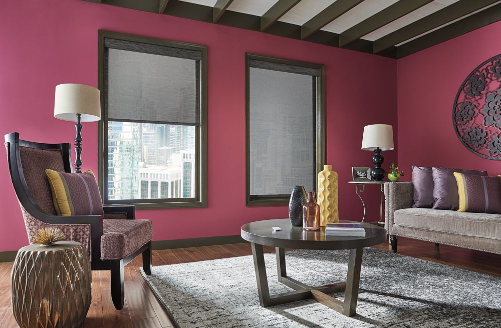
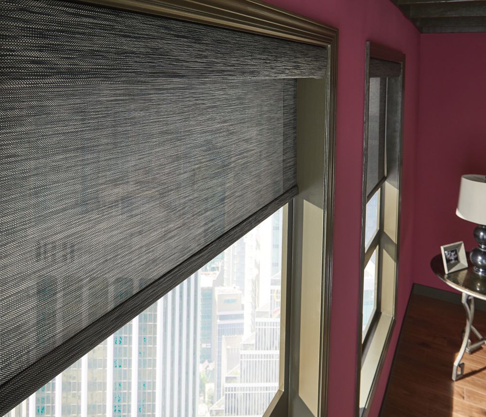
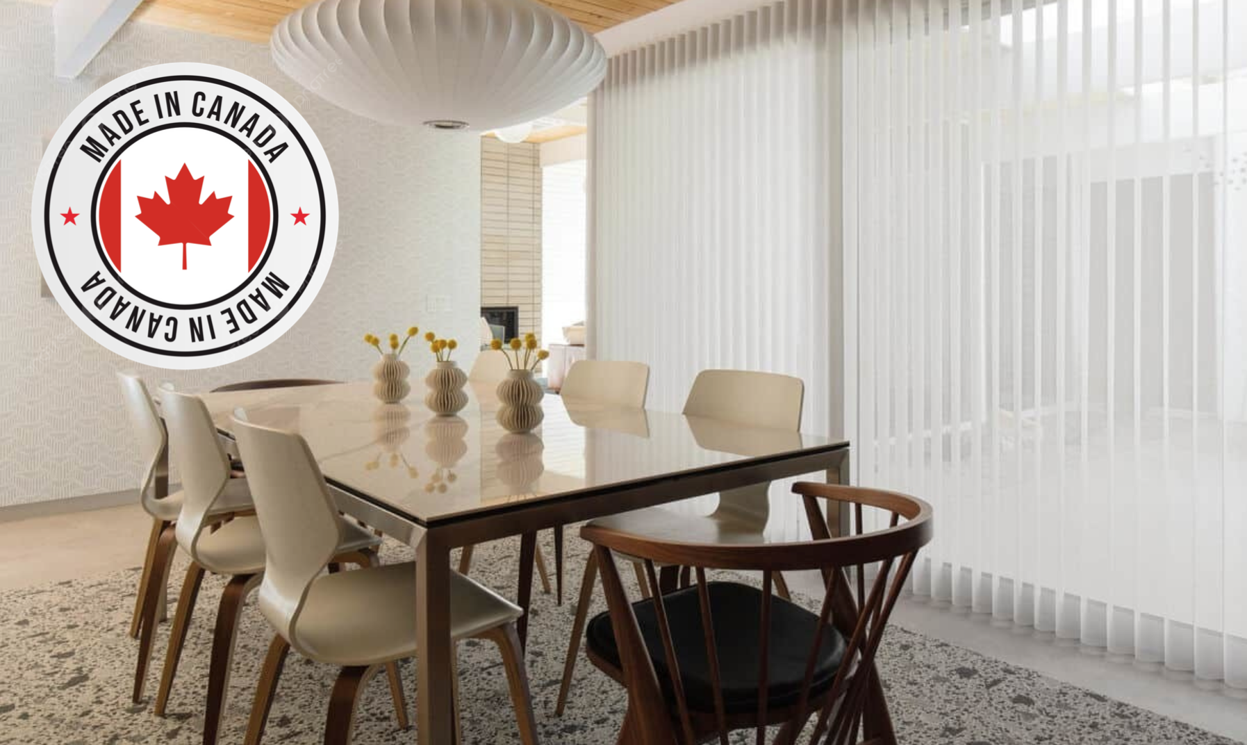
Luxury Window Coverings provides products available in a wide range of colours
When decorating or re-decorating your Toronto room from scratch, one of the first choices you’ll need to make is what colour-scheme you’ll want to go for.
Luxury Window Coverings provides products available in a wide range of colours and shades to suit pretty much any combination of colour-schemes, giving you enormous flexibility over the colours you choose for your rooms.
The colour scheme you choose for your room is ultimately likely to be based on the kind of mood you wish to promote within that room. All colours have a certain psychological significance and colour has been scientifically proven to have a direct effect on people’s emotions and behaviour.
Before choosing a colour-scheme for your redecoration project, consider the following colour associations…
- Pink:
A colour of love, peace and relaxation. Most-often used in bedrooms because of its association with restfulness and love. A more striking fuschia shade is often more associated with passion. - Red:
Most-commonly associated with danger, passion and energy. Red is vibrant, lively and ideal for rooms like dining rooms, where lively conversation and activity is most appropriate. - Green:
Green is another restful and peaceful colour-scheme largely through its associations with nature and the natural world. This makes it ideal, like pink, for bedrooms and also for lounges and sitting rooms. - Orange:
Closely related to red, this is another colour that invokes feelings of warmth, reassurance and general well-being. Not ideal for bedrooms, where its vibrant hues are likely to keep you awake, this is more suitable for living rooms and dining rooms where lively activity is to be promoted. - Blue:
Blue can sometimes appear rather cold and can make a room feel physically colder than it actually might be. Having said that, there are warmer shades of blue, which counteract this effect – and in general blue rooms are calm and soothing. As a result, it’s most suitable for bedrooms. - Yellow:
Unsurprisingly, yellow is the colour most associated with light, warmth and energy. It is naturally associated with the sun, so is ideal for darker areas of the house – and also for areas where liveliness and fun are to be promoted. Not best suited to bedrooms (yellow is not a colour to promote restfulness), it’s ideal for kitchens, dining rooms or lounges where fun and activity are the order of the day. - Purple:
The colour most associated with creativity. Used wisely, purple can create a happy, vibrant and creative atmosphere – but it also has some pretty dark connotations, being the colour of death and evil! Purple is a colour best restricted to bedrooms – except for the most adventurous! - Black:
It’s a brave individual who employs liberal use of the colour black within their decorating colour-scheme but used sparingly it can have stunning effects. Black is of course associated with death and depression so probably isn’t a colour you would really want to choose for a main living area of the house. Black rooms will of course be dark and appear smaller so should really be avoided for use as a base colour.
Ready to decorate? Find your products at Luxury Window Coverings in Toronto. Our wide selection of shades, sheers, honeycombs, blinds, and shutters will ensure you find exactly what you’re looking for. Reach out online or call us at (905) 449-3929